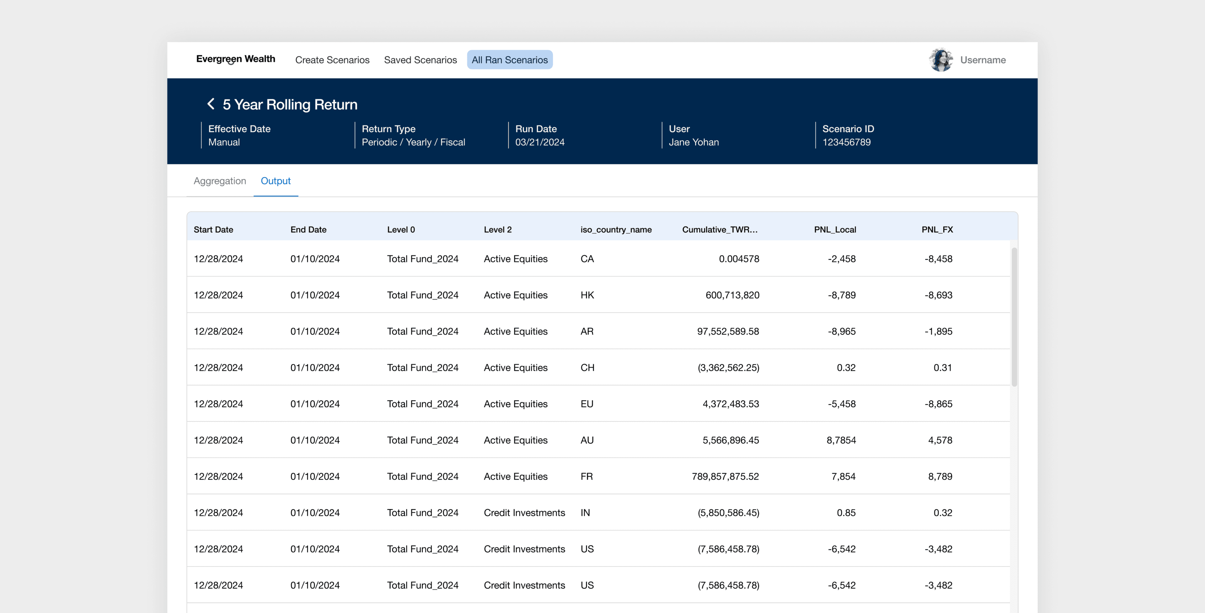
2024 July - 2024 November / Lead Designer
Designing an enterprise scenario planning tool that simplified complex financial workflows
Led end-to-end design of an enterprise scenario planning platform for EverGreen Wealth, replacing manual Excel workflows that cost performance managers 8+ hours per report. *Client name has been white-labeled due to NDA requirements.
User Problem
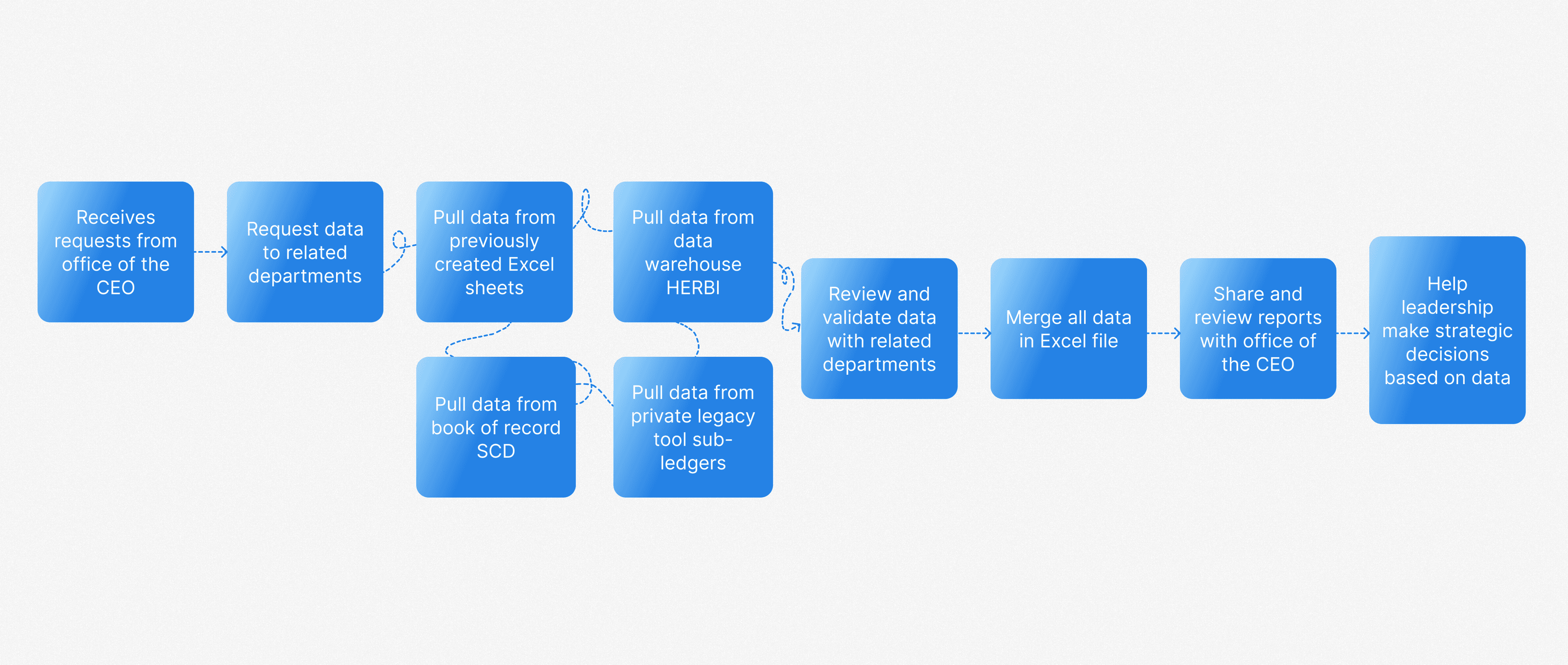
Custom reporting for complex scenarios is slow and fragmented
Performance managers at CPPIB oversee and analyze the financial performance of investments and ensuring alignment with the organization's financial goals. Their responsibilities focus on performance measurements, analysis, and reporting, which helps to inform strategic investment decisions.
Business Problem
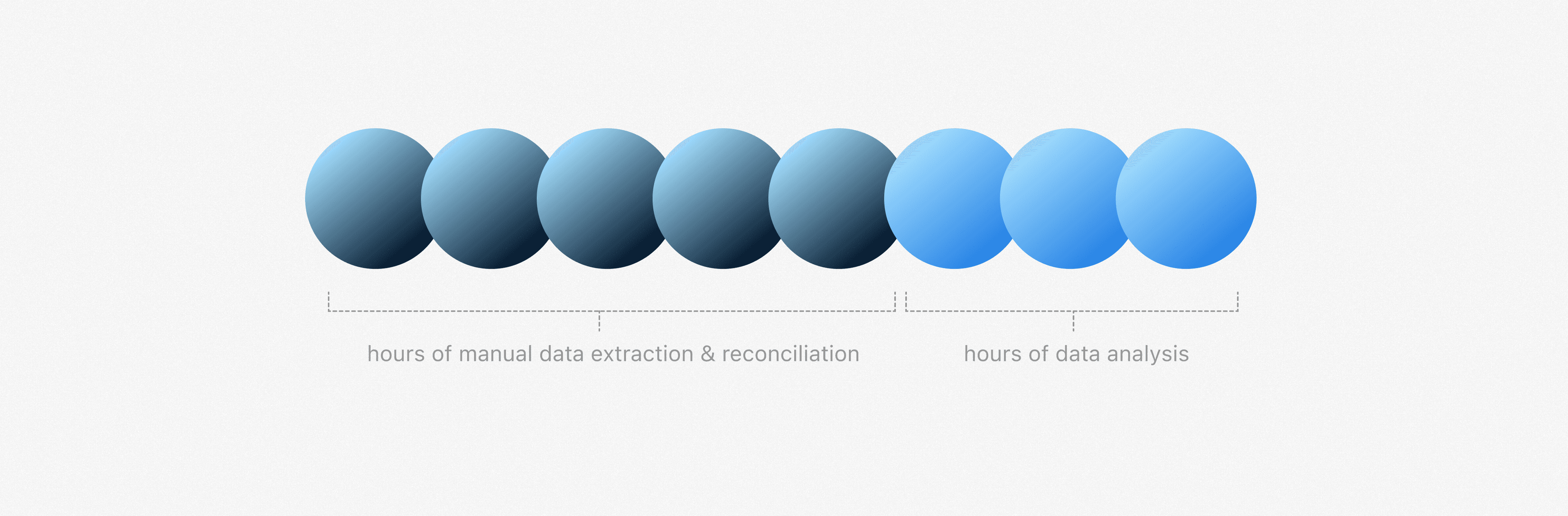
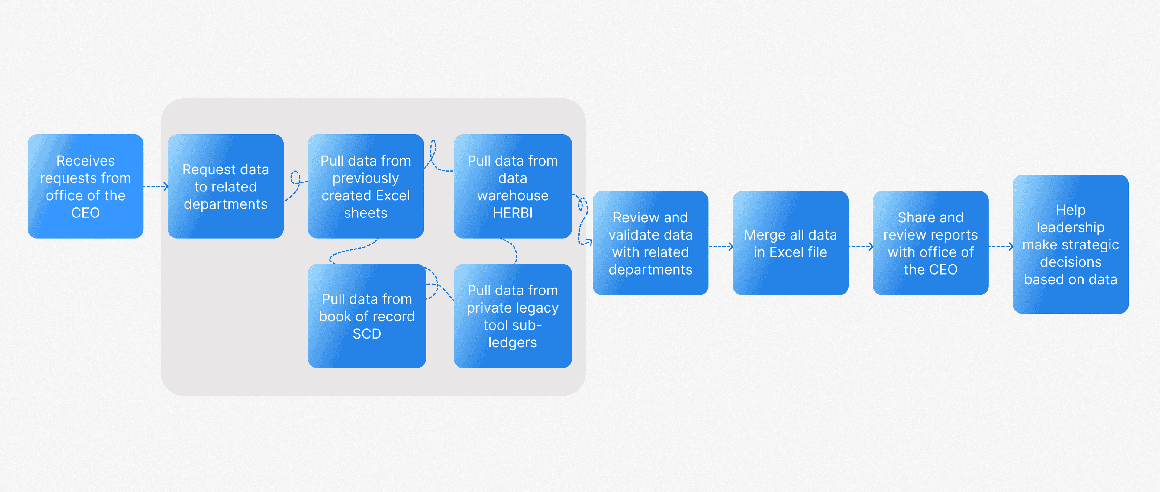
Of the 8+ hours per report, most is spent on manual data extraction, not analysis
Each report takes a performance manager 8+ hours to complete. The bulk of that time goes to manually extracting, cleaning, and reconciling data across legacy tools and Excel rather than the actual analysis and insight work.
Product Goal
Enable performance managers to quickly build custom reports
Design an enterprise product that enables performance managers to generate complex investment reports quickly and accurately, eliminating manual effort, reducing errors, and streamlining cross-departmental reporting workflows.
01 — Phase
Discovery
During the discovery phase, I prioritized understanding the performance managers' workflows and responsibilities. In the first two weeks of the project, I conducted 8 in-depth interview sessions with performance managers to learn how they currently build custom reports. This insight was critical to shaping a product that aligns with their needs and day-to-day tasks.
Understanding the role of performance managers at GreenWealth
Performance managers at GreenWealth oversee and analyze the financial performance of investments and ensure alignment with the organization's financial goals. Their responsibilities focus on performance measurements, analysis, and reporting, which helps to inform strategic investment decisions.
Reviewing legacy products to identify what works and what doesn't
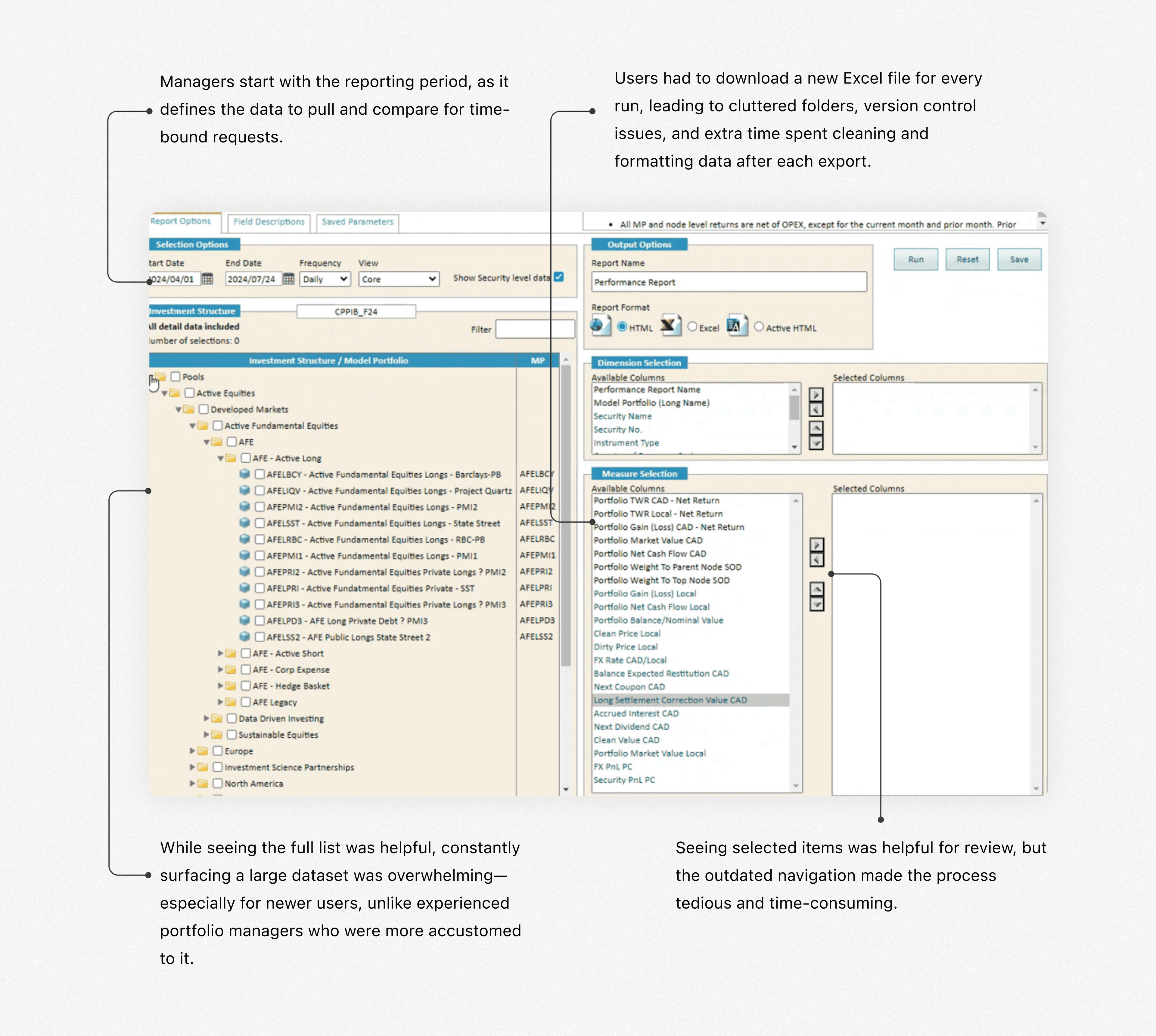
During 1:1 interviews with performance managers, I asked them to walk me through their legacy products and highlight what works and what doesn't. While the tool is outdated, understanding the elements they still rely on helped identify valuable features worth retaining in the new experience.
Insights from performance manager interviews
Given the complexity and nuance of their processes, these in-depth sessions were critical for uncovering actionable insights. Below are the key findings from the Discovery phase.
Switching Between Tools Created Workflow Friction
Performance managers juggled two legacy systems and Excel, each with different logic, slowing them down and increasing error risk.
Full Data Visibility was Valued
Despite a cluttered UI in the legacy product, they valued seeing all available data fields for greater control and confidence.
Often Duplicating Previous Reports
They often duplicated old reports and tweaked filters like date, region etc to save time.
02 — Phase
Define
After the discovery phase, I synthesized the insights and distilled them into key problems, which helped shape the design approach and direction.
Translating research into design strategy
After conducting user research and multiple in-depth knowledge transfer (KT) sessions with the product manager and performance managers, I synthesized the information to define a clear and focused design strategy.
Flexibility
Performance managers value the ability to define custom logic on their own terms. They wanted a solution that offers flexibility to create and modify logic to suit their unique needs.
Simplicity
Simplify complex processes to make them easy to understand and navigate, allowing users to perform tasks without unnecessary complications.
Familiarity
Maintain the unique workflows and replicate patterns that the users were familiar with Excel to reduce the learning curve.
Defining the first MVP for this product
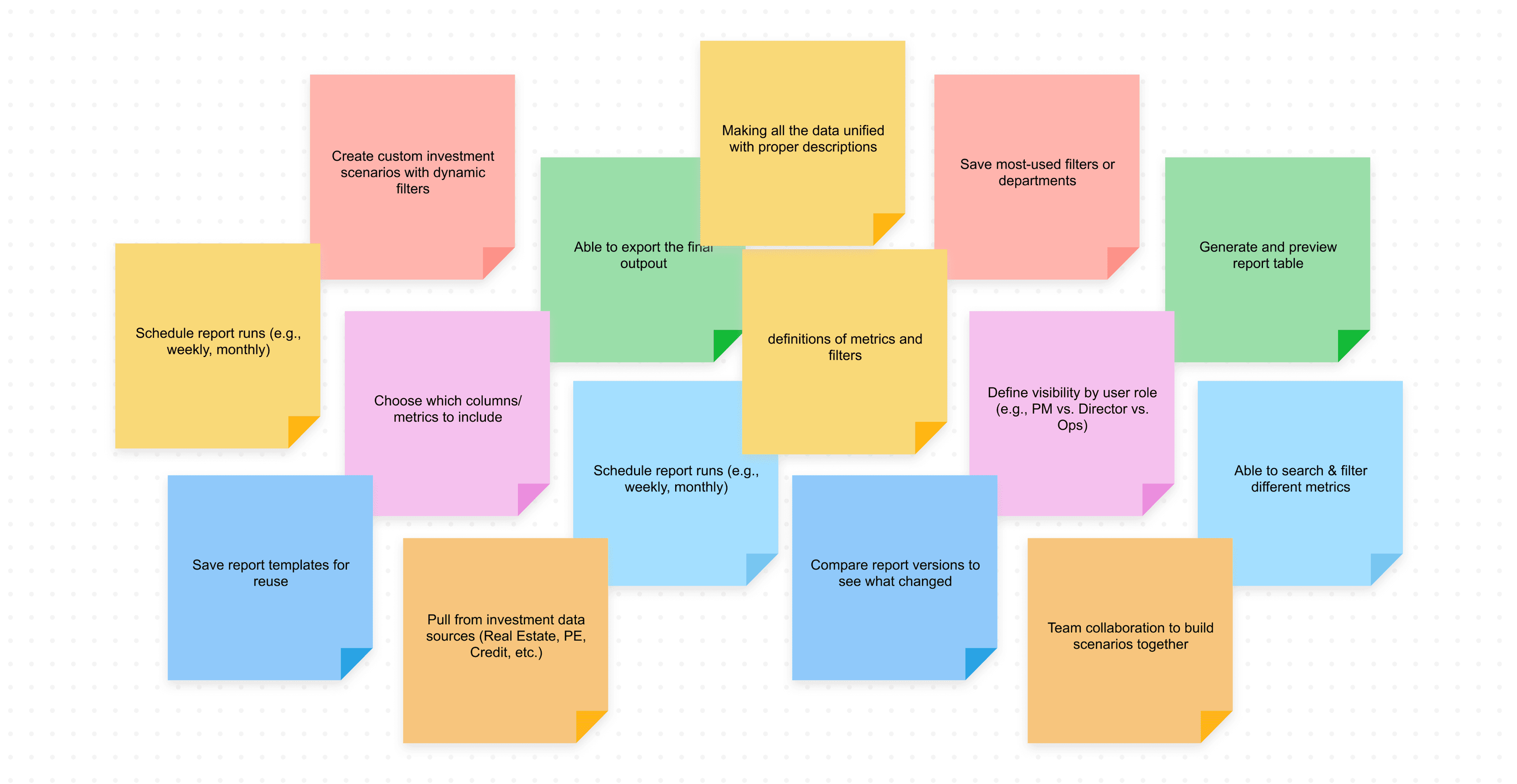
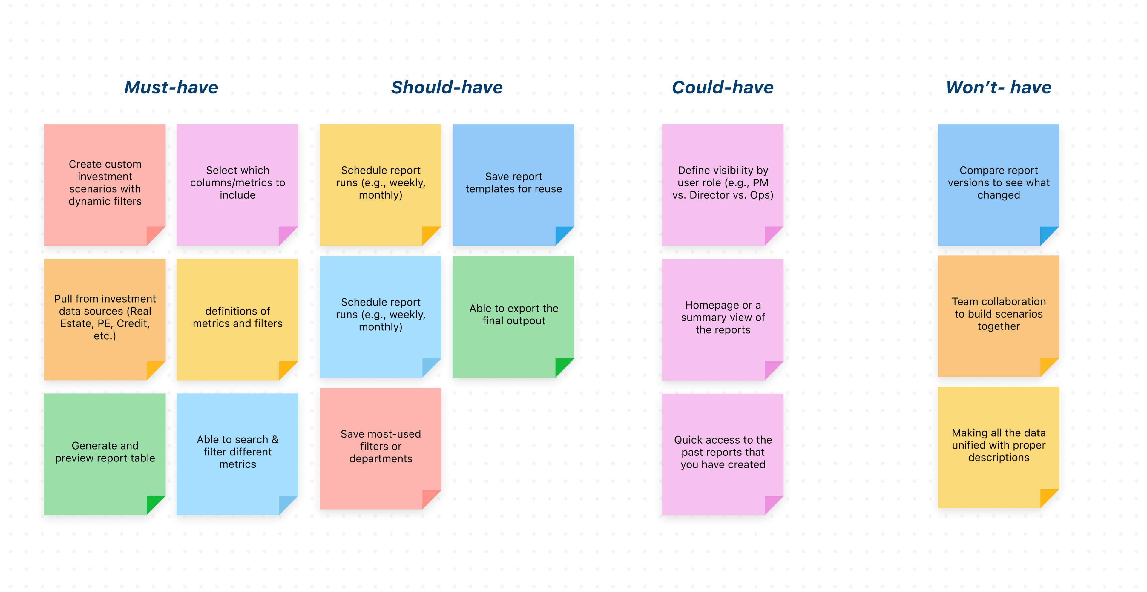
Before diving into solutions, I led a collaborative session with the product manager, tech lead, and three business stakeholders (VP of Finance Performance, Senior Director Performance Management, Senior Performance Manager) to define core features. The main challenge was aligning on the MVP, as the team often pushed for "nice-to-have" features. To address this, I facilitated a focused 1-hour workshop to prioritize and clearly define the core MVP.
03 — Phase
Develop
To kick off the solution phase, I led a fast-paced workshop with the internal team to draft initial concepts. Given the tight six-week timeline, the process involved frequent white-boarding sessions with the core team to sketch ideas, define key use cases, and align on direction. I translated these concepts into Figma designs and maintained a tight iteration loop for rapid feedback and refinement.
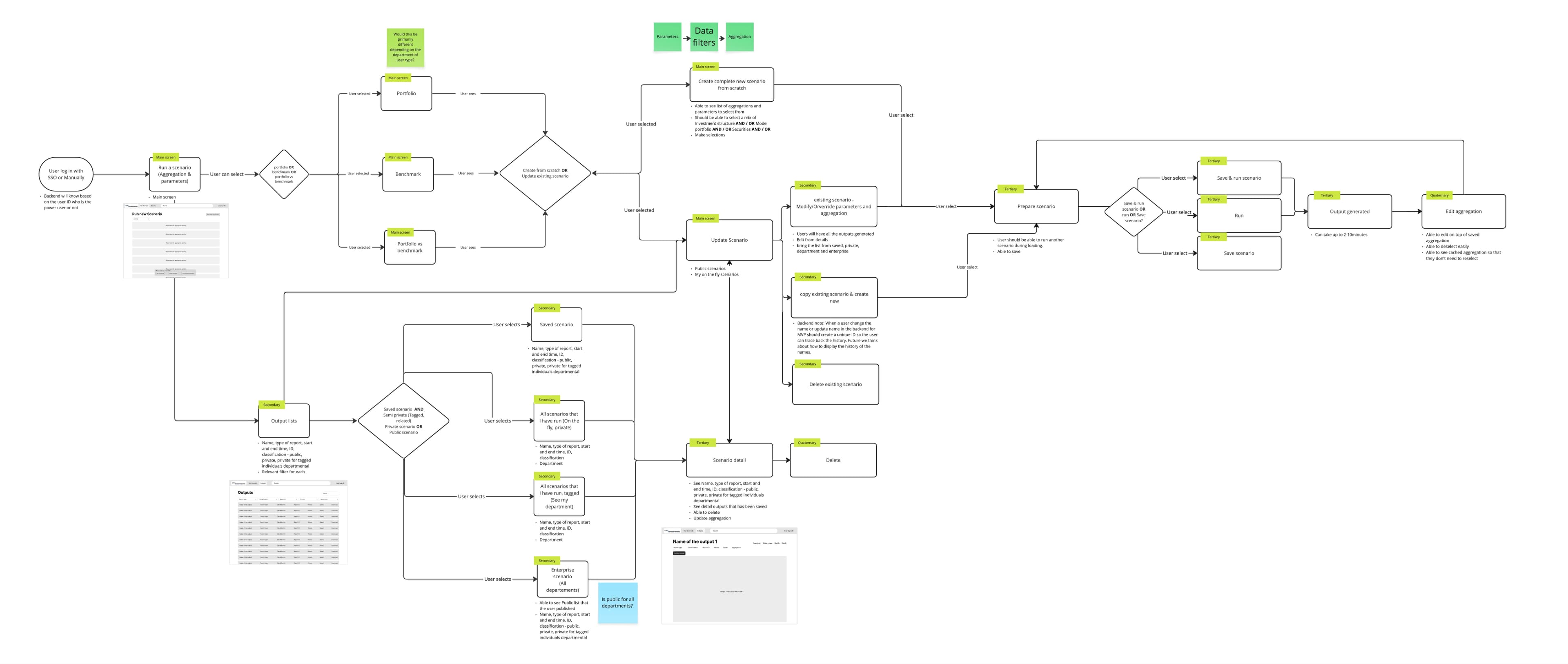
Creating the core user flow together
I facilitated a white-boarding session to map out the core use cases and define the main user flow. By first sketching a basic skeleton of the "happy path," I gave the team a tangible starting point, which we then refined together through live feedback and iteration. This collaborative process helped align everyone on the foundational structure before moving into detailed design.
Designing the best layout for performance managers
To determine the most effective layout for scenario-building, I explored three low-fidelity options, each reflecting a different interaction model. My goal was to find the best way to support power users in building custom financial scenarios efficiently and confidently.
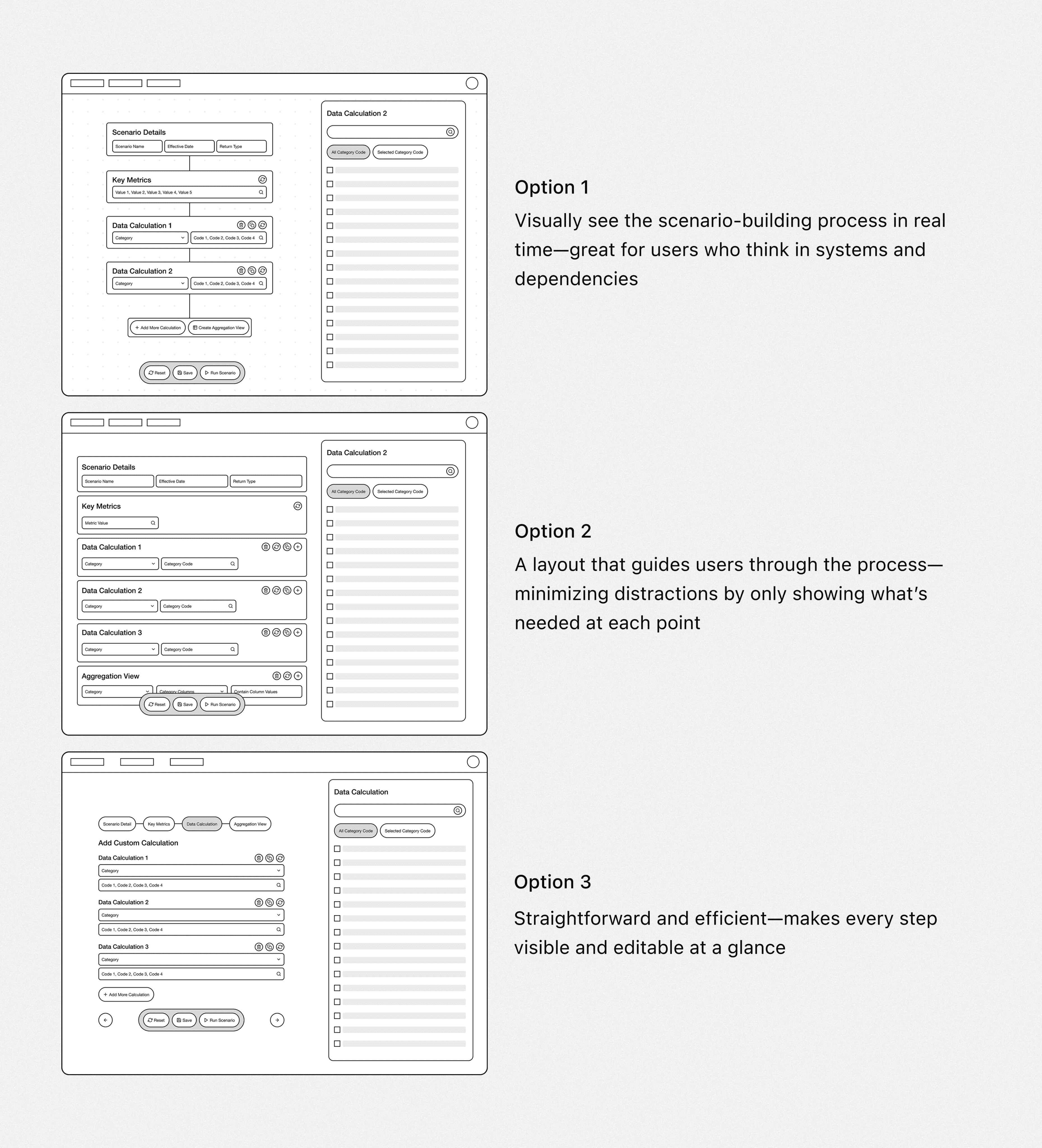
Evaluating design trade-offs with product and engineering stakeholders
I presented each low-fidelity option to stakeholders across product and engineering. We discussed trade-offs for each layout.
High Effort, Low Impact
The first option requires significant front-end engineering effort but offers limited user value, making it difficult to justify the level of custom development.
Excel-Like Experience
Across all options, stakeholders emphasized the importance of preserving familiar data behaviors like tabular layouts and multi-step formulas commonly found in Excel.
Lack of Guidance and Unclear Layout
The team raised concerns about Option 1 feeling too open-ended for new users, especially without guidance or visual grouping.
Choosing the right design path
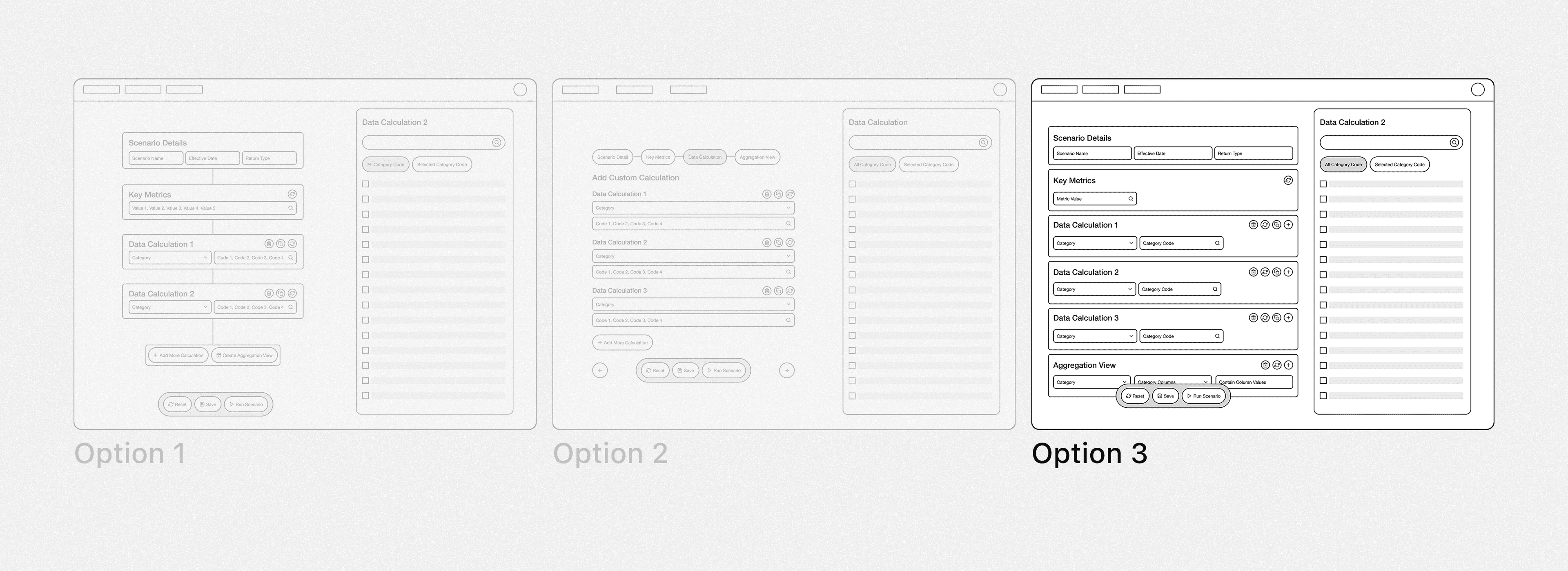
Initially, I was biased toward the first design option, as I believed it clearly represented the scenario being built. However, after discussions with the team and quick feedback sessions with performance managers, it became clear that users preferred an interface more aligned with their legacy tool. The first option felt overly complex and unfamiliar to them. Additionally, it posed significant front-end limitations and scope challenges, which led us to explore the third option further.
04 — Phase
Design Solution
Layout aligned with users' logical workflow
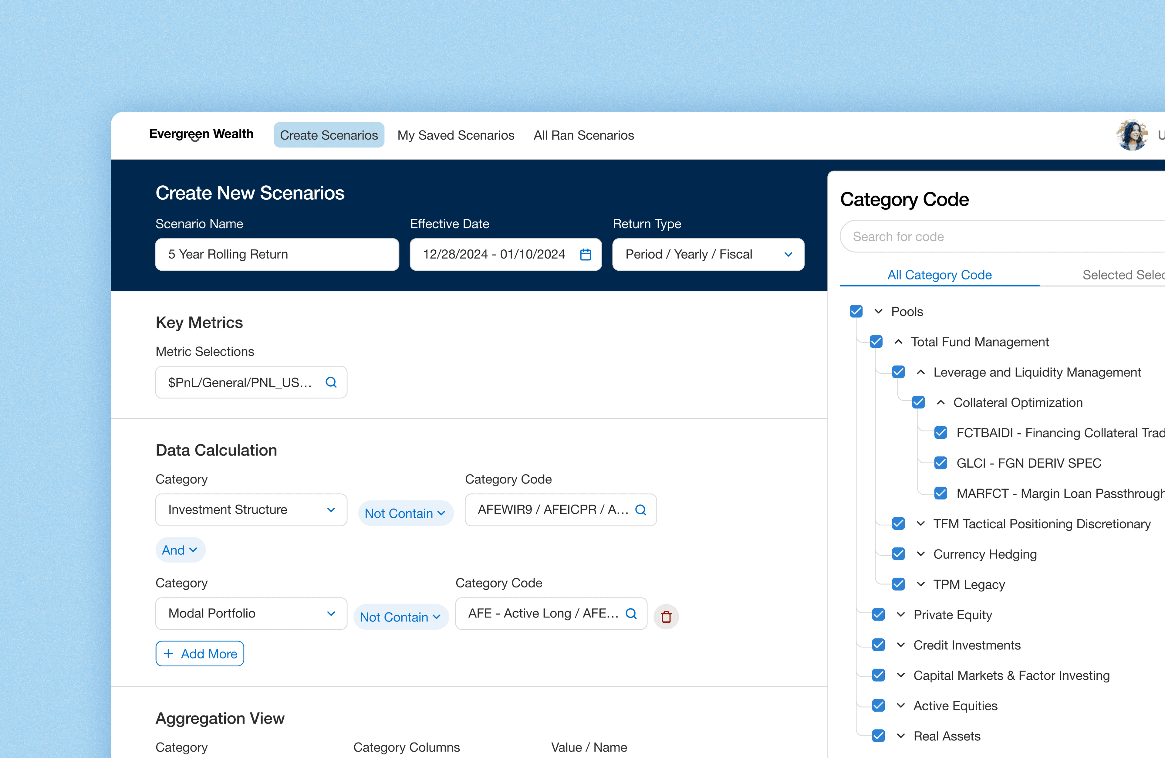
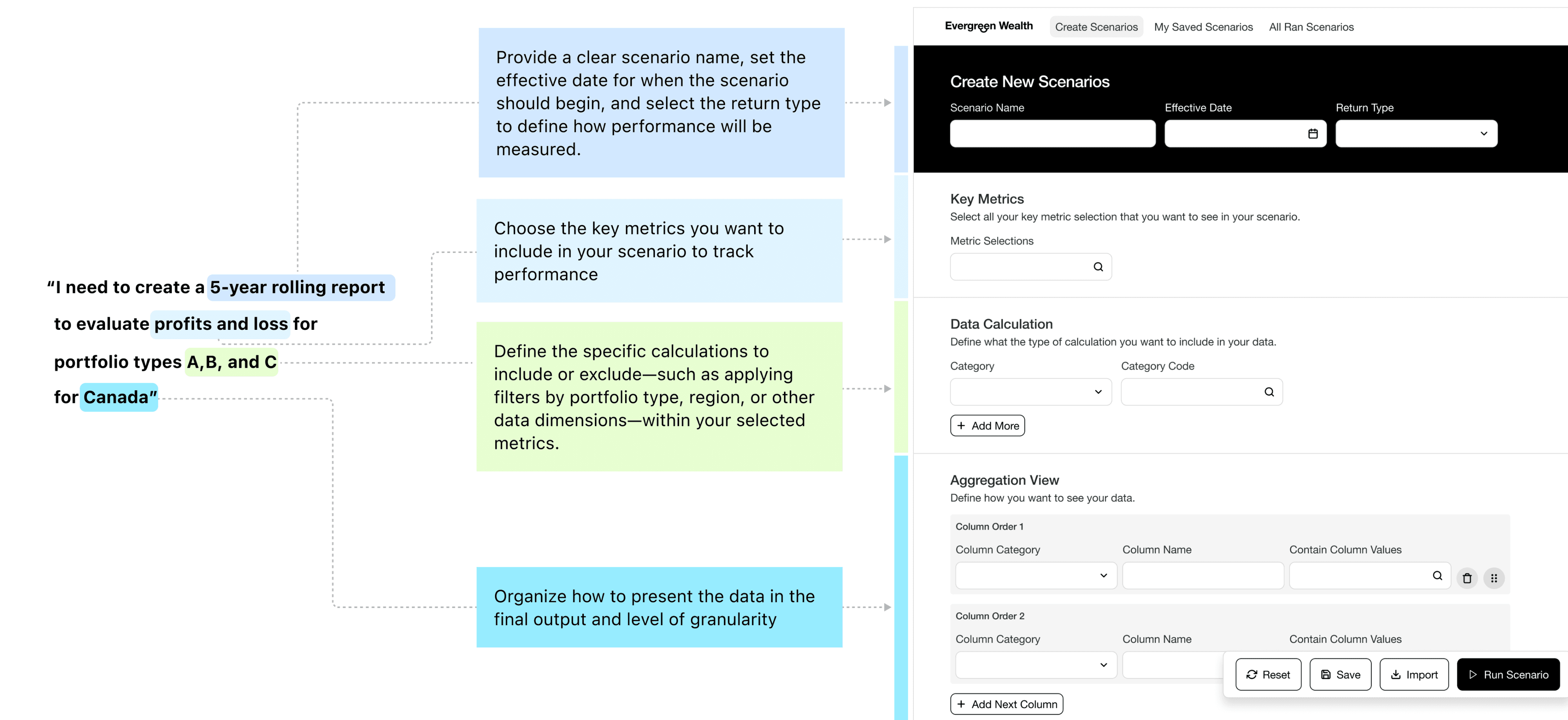
The final design approach prioritized a flow that mirrors how users naturally think through scenarios, starting with defining key parameters (e.g., dates, return type), then selecting metrics, and finally organizing the data. This structured sequence supports clarity, efficiency, and familiarity.
Helping users to sort through the long list of metrics easily
The most important aspect for users was the ability to quickly select specific key metrics and perform metric aggregation. Users needed to view all available data, but also be able to quickly filter and select the relevant metrics for their reports.
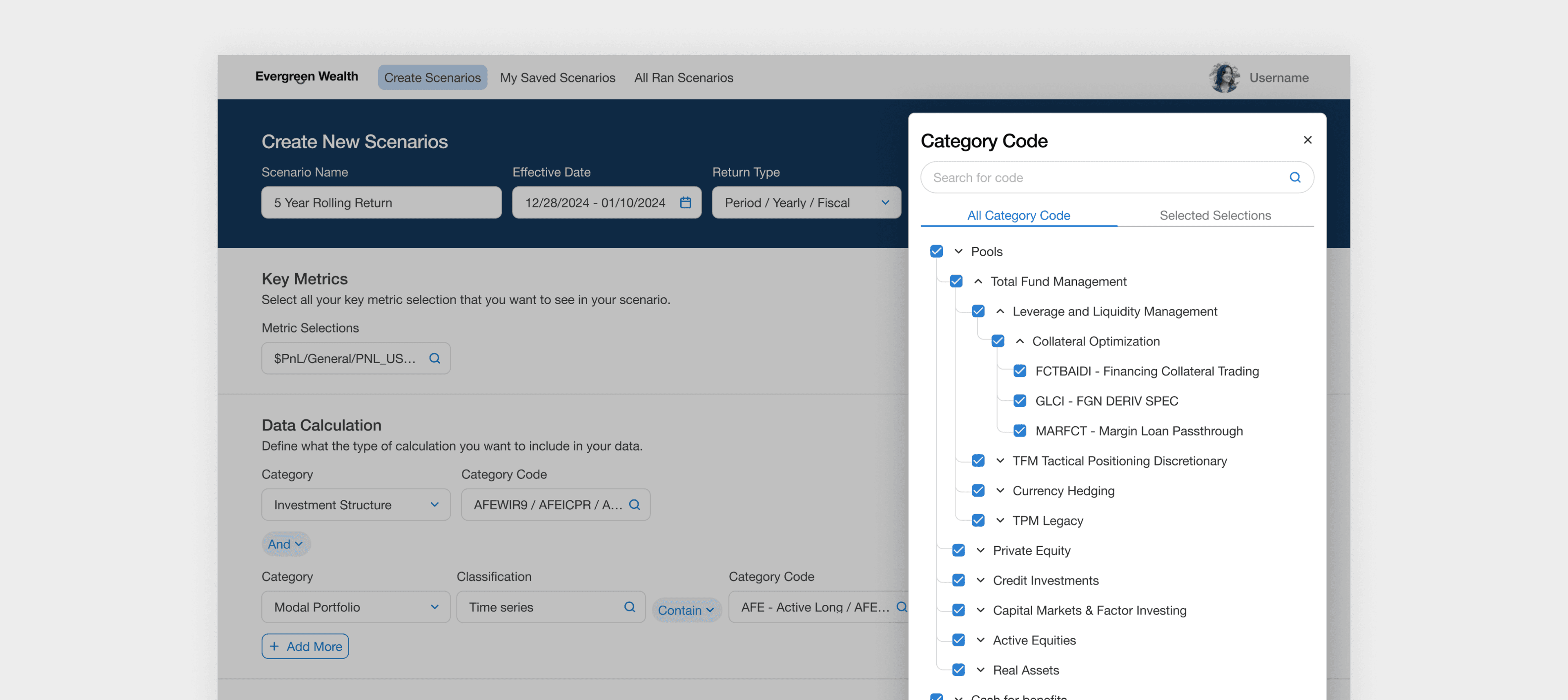
Improving usability for long lists through group and level selection
Users can navigate groupings in bulk, avoiding the need to manually sift through each grouping. This makes the process faster and more manageable.
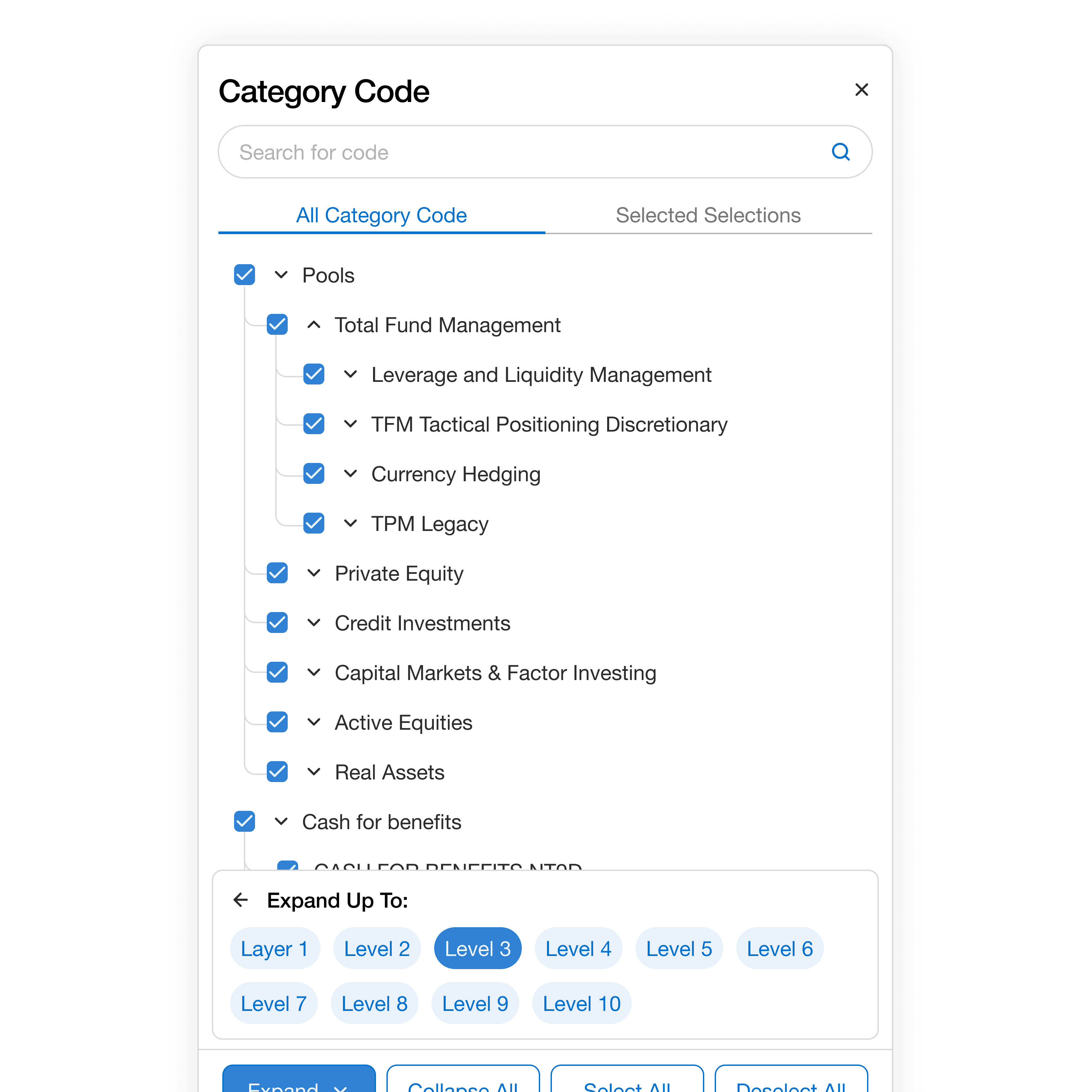
Find fields instantly with quick search
If users know the type of field they're looking for, the quick search feature helps them find it instantly, eliminating the need to scroll through long lists.
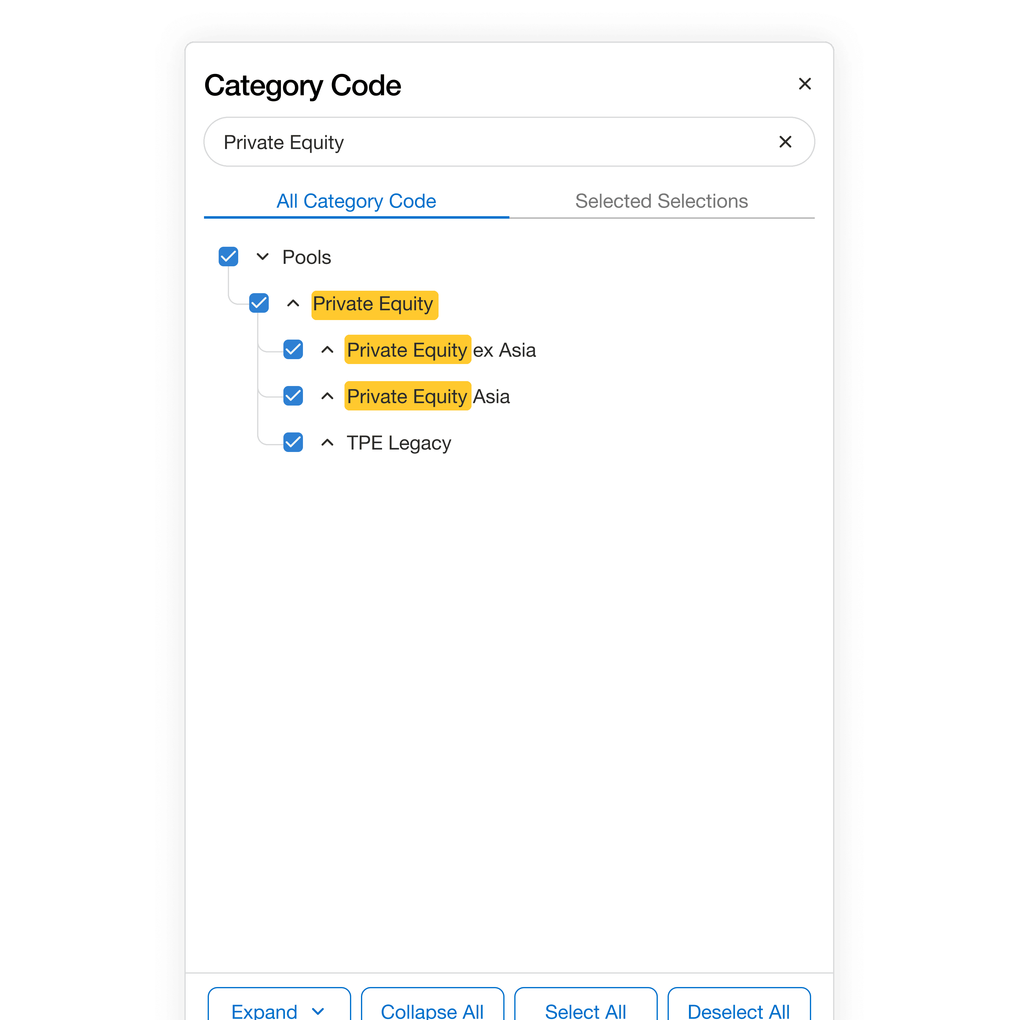
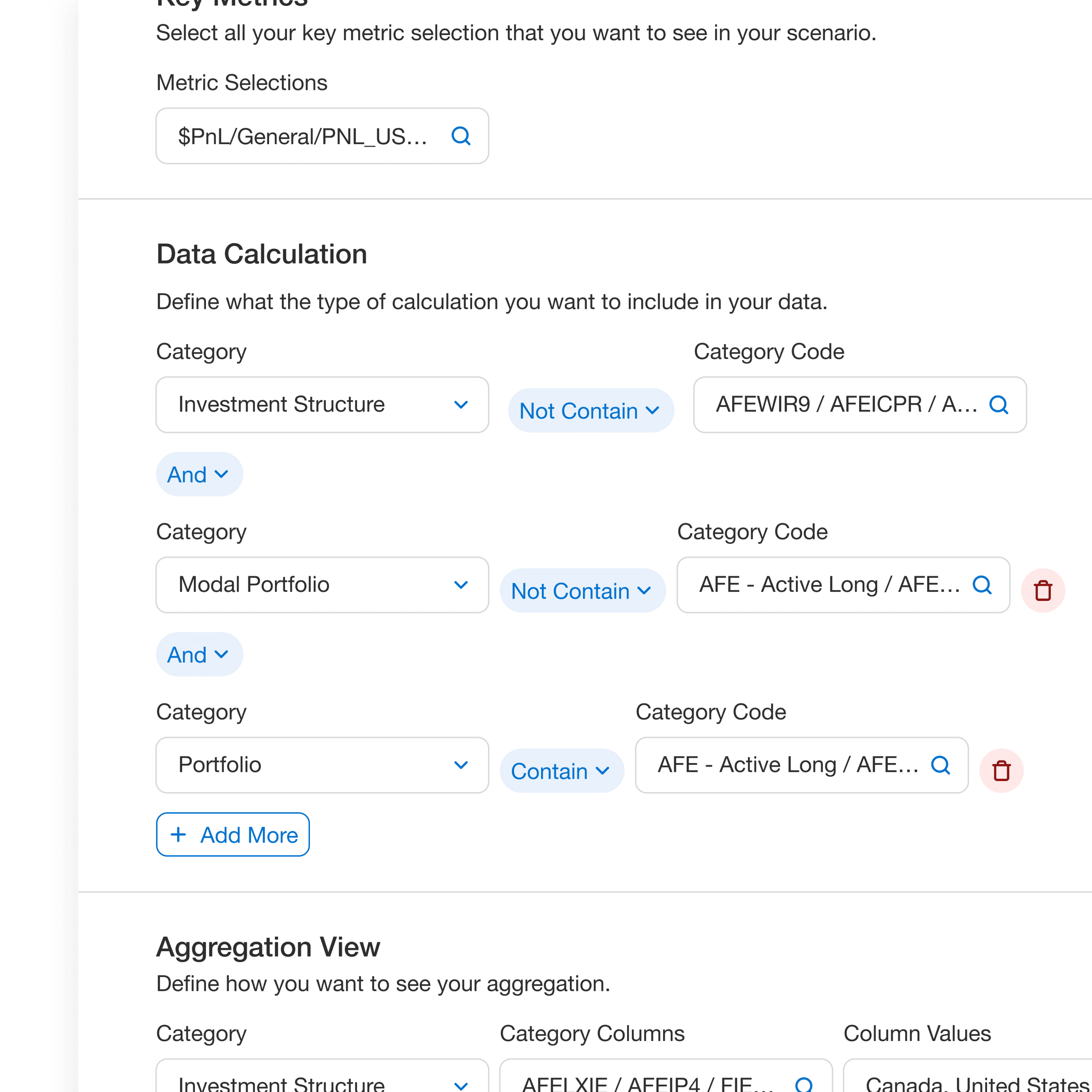
Give flexibility to easily include or exclude specific types quickly
A key feature for users is the ability to define which investment strategies to include in their metric calculations. The challenge was to give users the flexibility to easily include or exclude specific investment types or categories in their calculations through an intuitive interface.
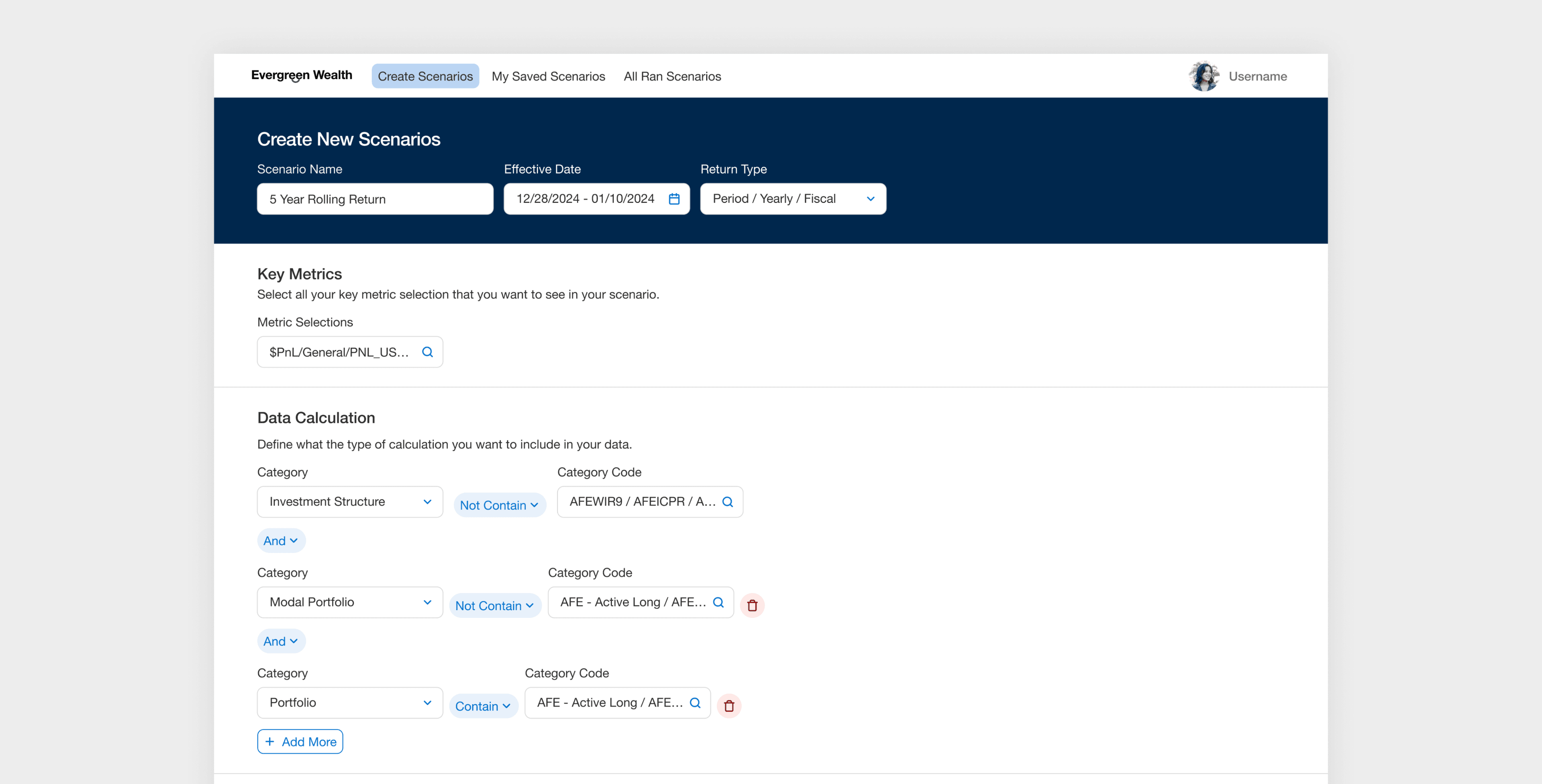
Define custom logic with conditions
Users can define specific conditions to automatically filter data used in metric calculations. For example, when focusing on certain investment types, conditional logic surfaces only the relevant data, streamlining the workflow and reducing both manual effort and cognitive load.
Letting users choose how data is displayed
This solution provides users with a dedicated section where they can select how to organize their data in the final scenario. Users can define the specific category values and reorder the groupings in a way that makes sense for their analysis.
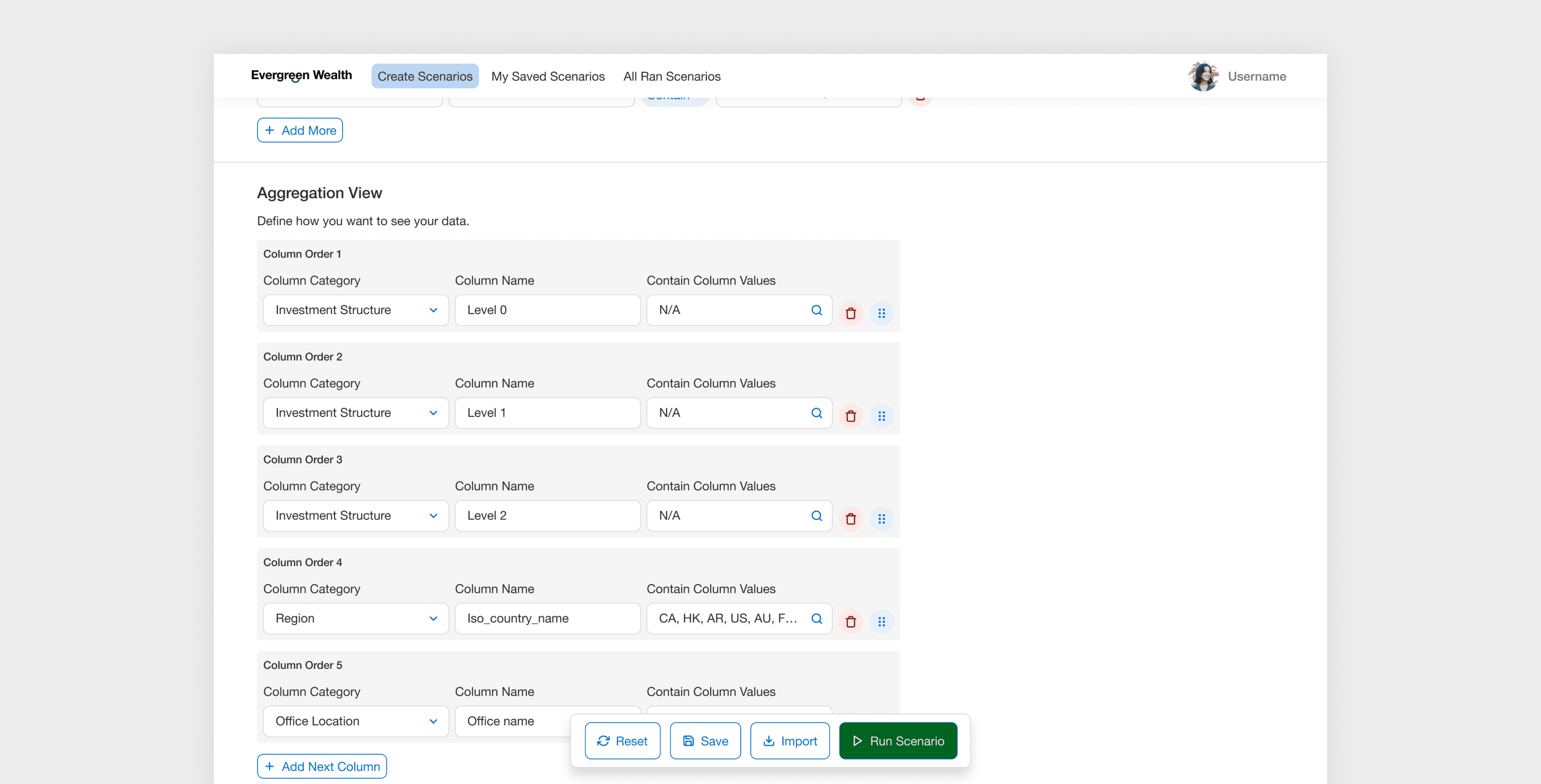
Preview the final report
A key functionality for users is the ability to preview data after completing the scenario setup. Once all conditions, filters, and selections are in place, users need an easy way to run the scenario and view a preview of the final report, helping them validate their inputs, catch errors early, and build confidence in the results before sharing or finalizing.